Improving the design of a tour operator’s website
Published on Tuesday, January 20th 2015 by Alex Hopson
Case study: Kudu Travel
Recently Webbed FeetUK redesigned the website for the tour operator Kudu Travel. Our main goal was to increase the number of tours booked online, and to increase enquiries. Their newly designed website not only looks beautiful, it has clear calls to action and improved Search Engine Optimisation (SEO).
Improving conversions
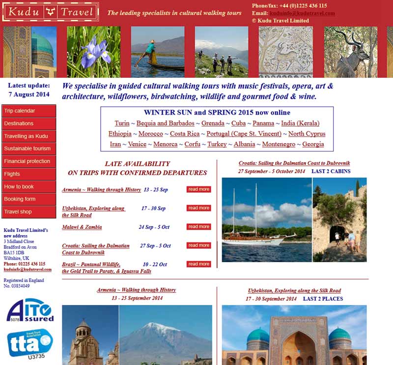
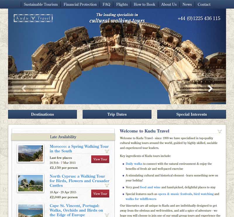
If you look at the original home page you can see a wealth of information and options for the potential visitor. Contrast that with the new website, which was designed to clearly introduce the tour operator’s website, explaining that they specialise in walking tours. The large imagery captures peoples’ imagination, and the three main calls to action to view the tours stand out due to the lack of clutter. When using this page browsers know exactly where to click to see the tours.
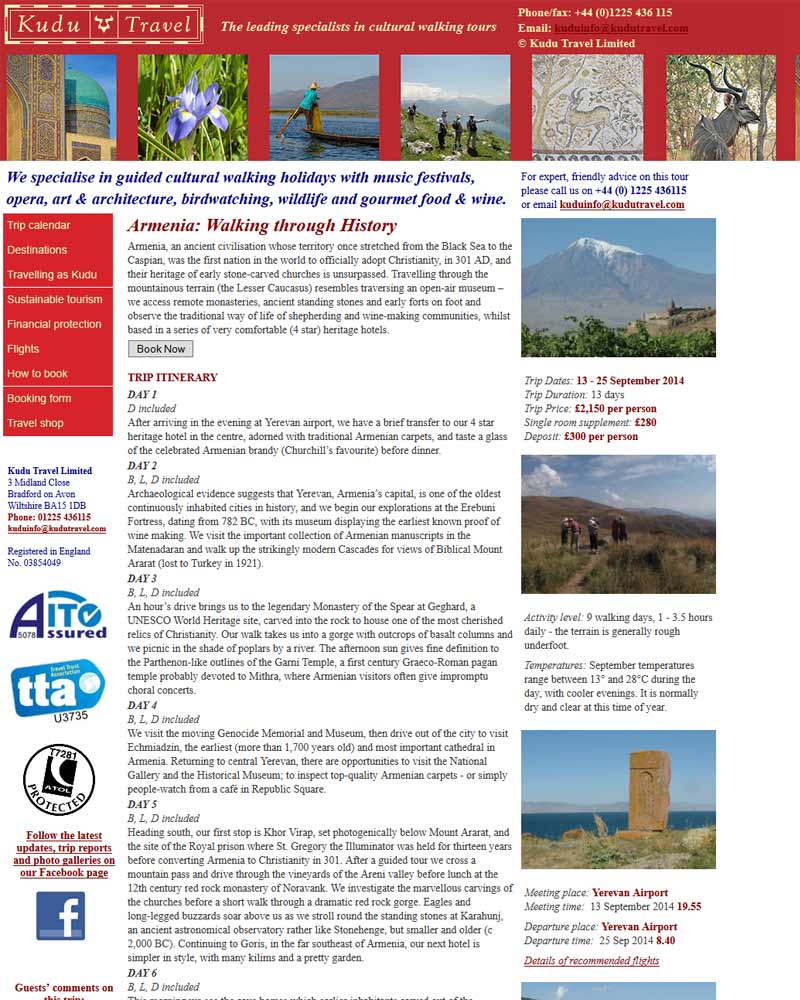
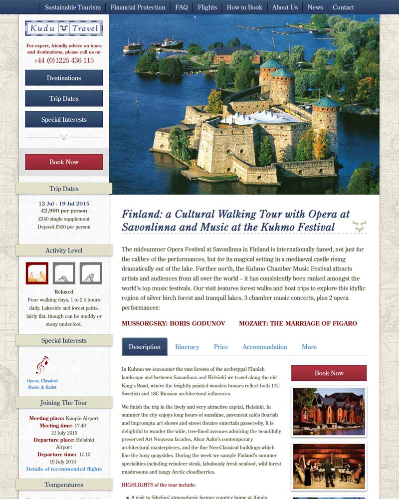
The tour pages were also filled with information, with distracting side bars and headers. The single most important thing we did on this page’s design was to ensure the most prominent part of the page was the book now button, in bright red against a muted background it immediately draws your attention. If you look at the older page you’ll see a light grey button on a white background next to a large block of red that pulls your gaze away from the button. We laid out the key facts about the tour on the left hand side and the content was broken into easily digestible chunks.
Tours sell by sparking your guests’ imagination, and there’s no better way to do that than having beautiful, large photographs of the tour. Imagery is a key part of the new design, and in addition to the slideshows topping each page we have added a tour photo gallery.
We have also worked hard to reduce the barriers to people purchasing tours. Many tour operator websites are designed to require a lot of information before you make a purchase; we moved this to after the purchase is made to remove it as an obstacle to making a sale.
More than just a redesigned website
Built into every part of the code and structure of the site is strong search engine optimisation. It’s all well and good having a beautifully designed website, but if people can’t find it then it’s wasted. Our SEO specialists work with our web designers and coders, and our coders all know the best SEO practices. We offer advice on how to write your content effectively, and can monitor and improve your SEO after the launch of your website.
What we do
This is hardly an exhaustive list of what we’ve done when designing this tour operator website, but it does show the level of detail and care that goes into our designs. The tour operator websites we design are focussed around improving your rate of sales and enquiries, of course we make sure they look stunning as well but improving your sales is our key goal.
One of our directors and project managers Alex Hopson is very well travelled and knows the industry inside out, and we use this to our clients’ advantage when designing and building our travel websites. So if you’re after a travel or tour operator website, or any other website for that matter, then please get in touch with the team at Webbed FeetUK.


