Spur Creative
Prop Makers & Effect Specialists
Spur Creative Workshop design and create high-quality props, models and sculptures.
The objective
To rebuild the website from the ground up with search engine optimisation (SEO) in mind. The existing website design was dated and in need of a complete overhaul.
The research
Before starting any project that has legacy SEO implemented is to do thorough research and make sure what has been done has been done well. Two areas to look at were finding out what the client actually wants to be found for and to have a look at the existing user experience on the website. It didn't take long to figure out that the initial SEO focus wasn’t quite working and the website had an incredibly high bounce rate. The website had a very high amount daily users but none of them were interested in using the services of Spur Creative. Quantity doesn’t mean quality.
So the first thing to do was thorough SEO research into keywords and remove anything that wasn’t going to get the client business.
Another reason for the poor bounce rate on the website was the design and user experience itself. Imagery on the website was small and not showcasing the incredible work our client does.
The solution
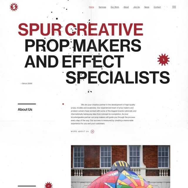
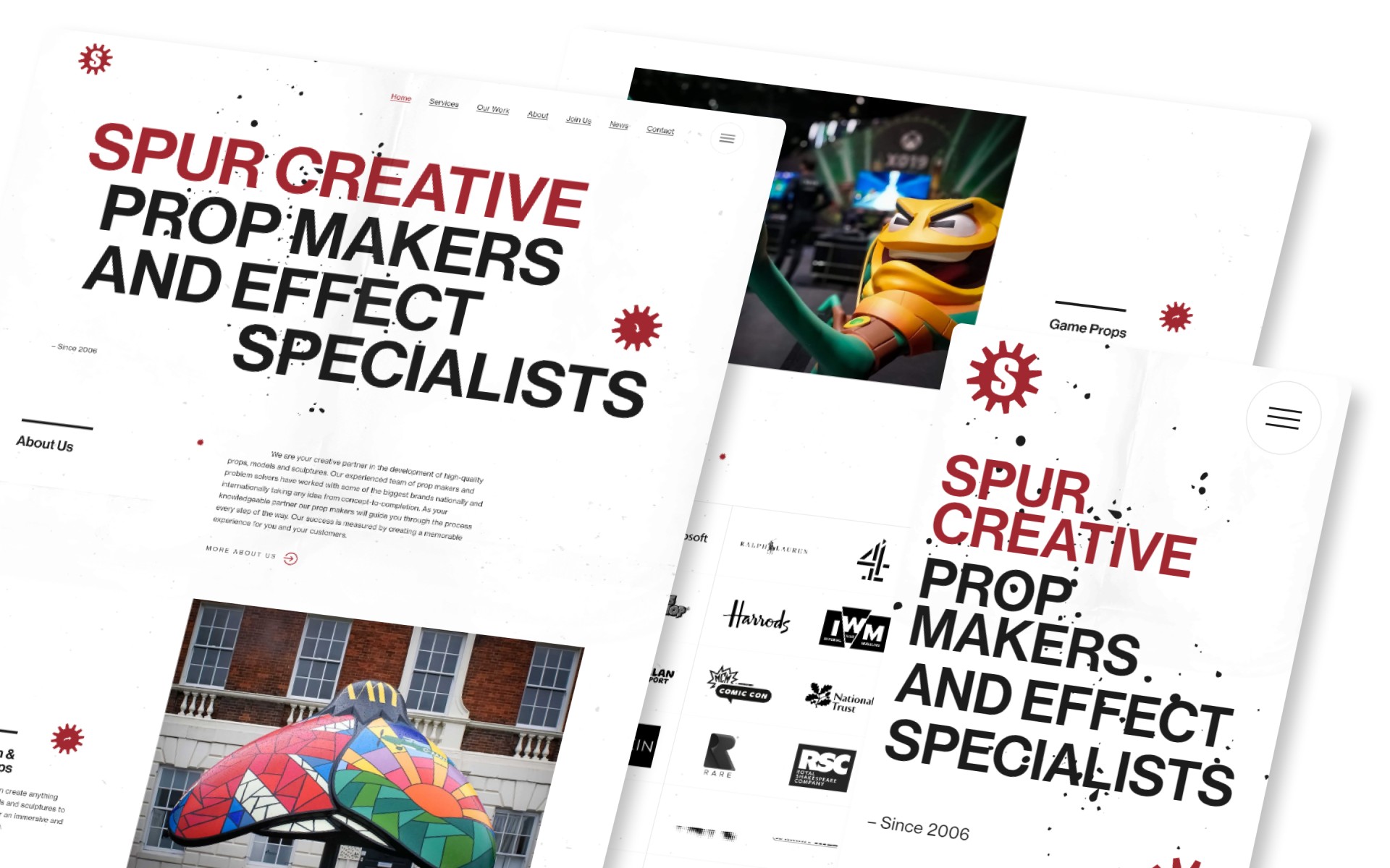
Spur Creative Workshop are in fact ‘creative’. It’s in the name. So the new website design needed to be creative so like minded users will instantly engage with the website. To do this we decided to have a large font introduction animating in to say exactly what the client does which instantly grabs the attention of the user.
Core menu items feature at the top of the website to not confuse the user journey with all other pages present in a full screen menu. As the menu opens this generates a creative stagger animation revealing each elements one by one not to overwhelm the user.
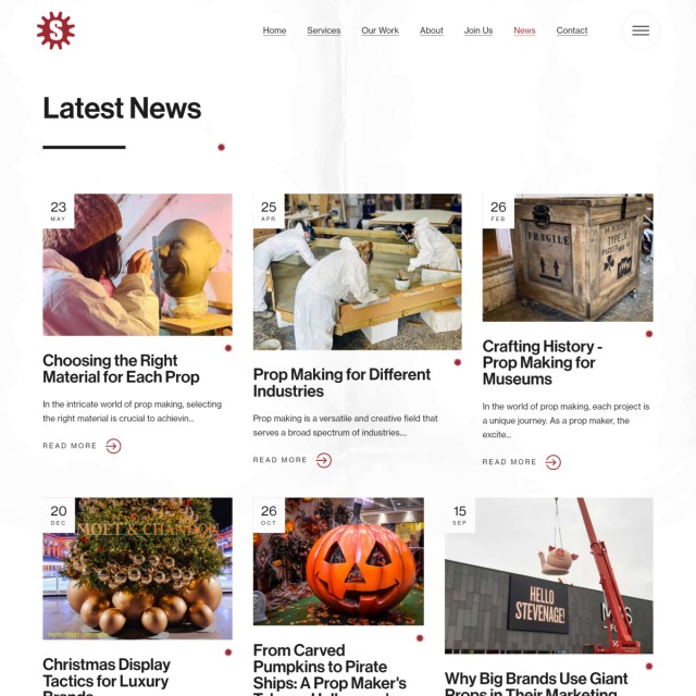
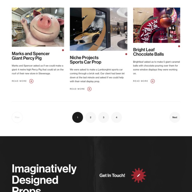
The general layout of the website is bold in both content and imagery to showcase the clients work and separate large amounts of text. To rank well in search engines you need to have a decent amount of text on each page but you don’t want it to take priority over everything else. With the use of simple grid and larger fonts you can easily separate everything.
We decided to implement page transitions so that elements animate in and out aiding to the overall user experience.
The website has been developed using Laravel which is a modern PHP framework. The website is fully mobile responsive adapting to multiple screen sizes. Whilst the website users a lot imagery performance is always key. Especially now as Google will now rank websites based on its user experience/performance and well good SEO fundamentals.
There’s much more going on under the hood.
Get in touch
If you are looking for a creative website or any website for that matter, please get in touch by contacting us today.

